Color Palette – A New Collection of Pre-mixed Colors



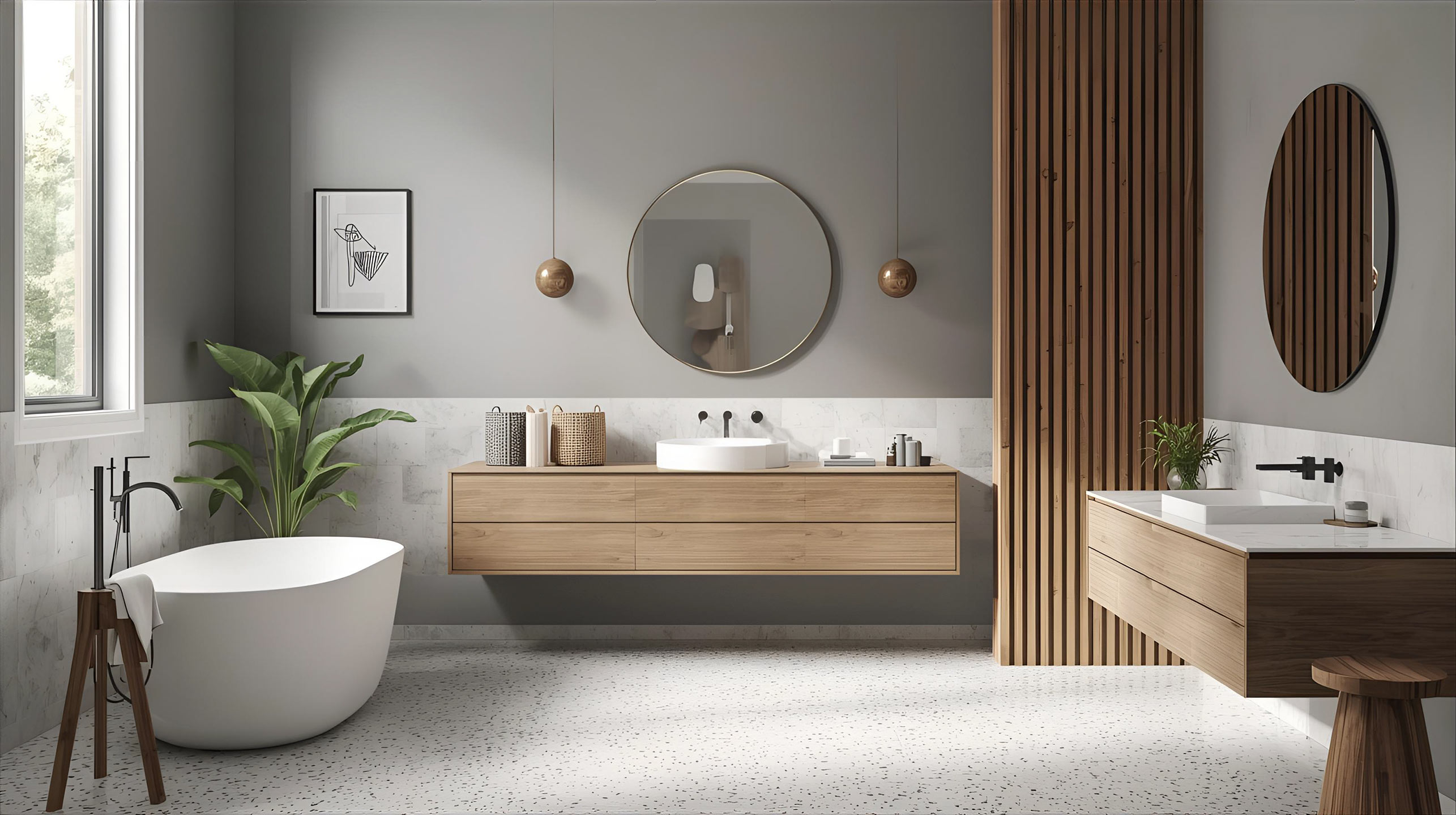
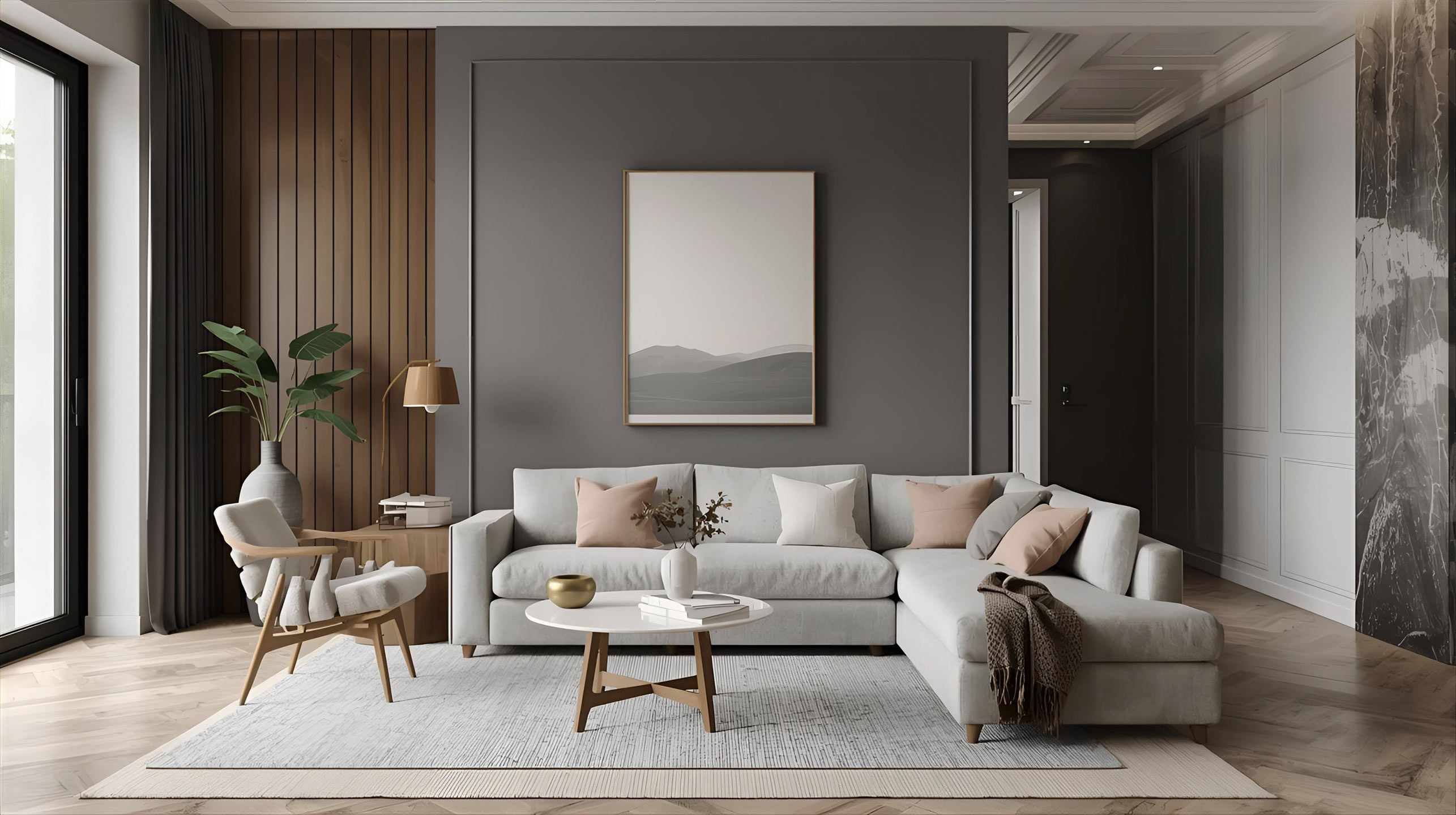
A well-designed color palette makes it easier to choose paints and coordinate shades within a single room or even according to the function of different rooms. Pre-designed collections speed up the decision-making process while allowing you to create cohesive color schemes throughout your home. This is a great solution when you want to add a touch of something new without having to repaint the walls or buy new furniture.

What is a color palette, and how do you use it?
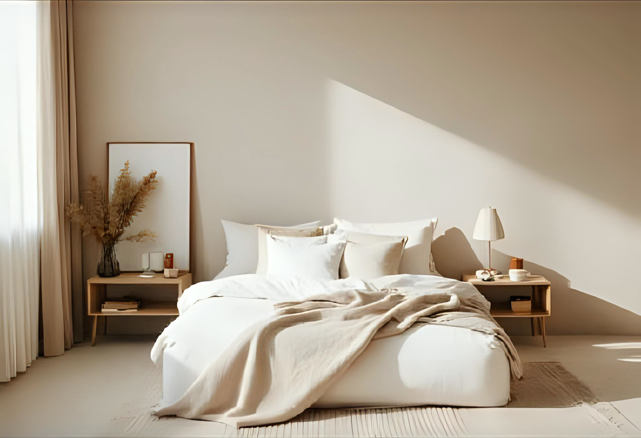
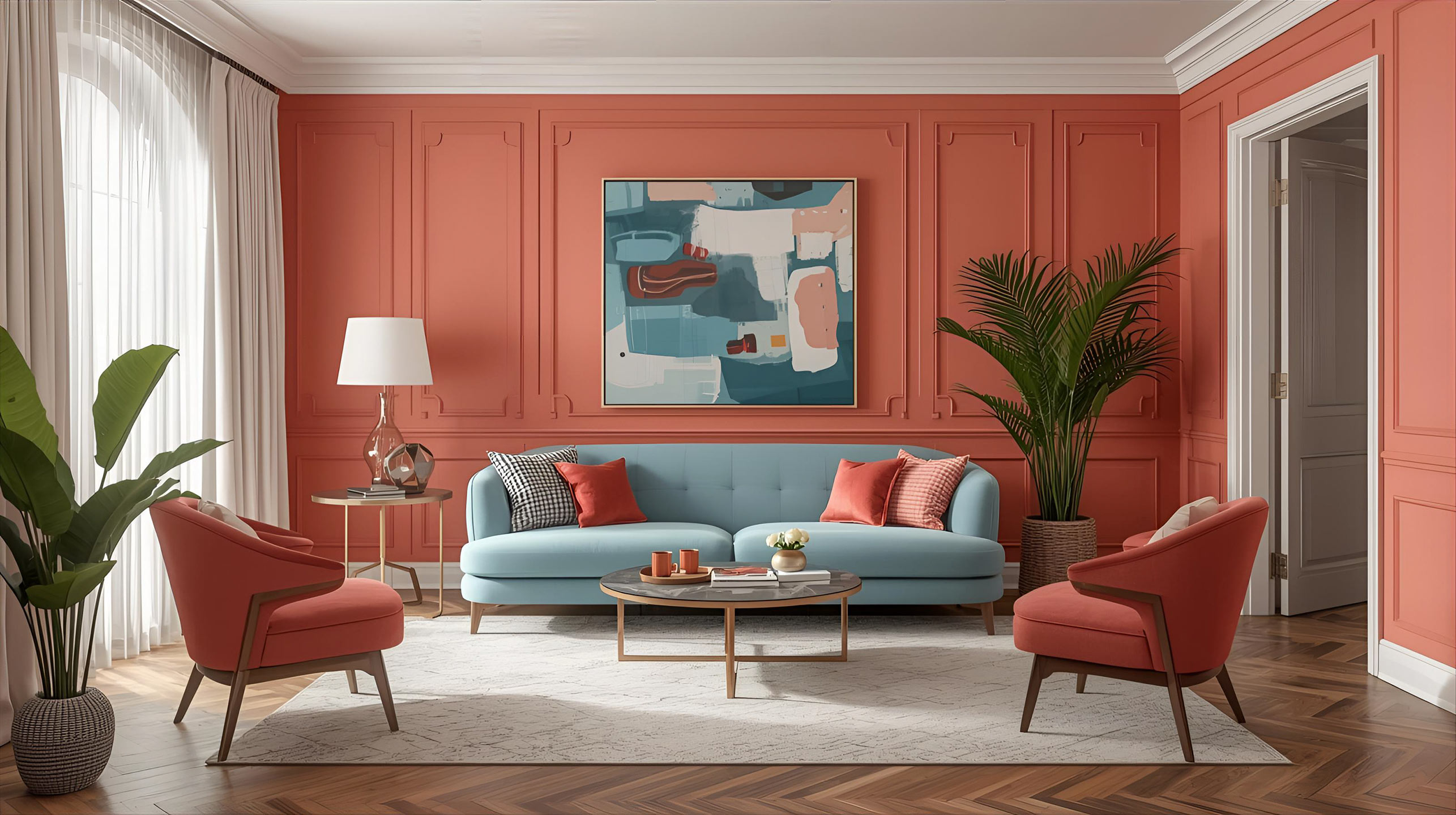
A color palette is a set of shades chosen to harmonize with one another. In interior design, it makes it easier to establish a dominant color scheme and accents, so that rooms look cohesive but not identical. When using a color palette, you choose a base color (e.g., neutral beige), 1–2 complementary colors (warm gray and green), and an accent color (a deeper brown on one wall or on furniture fronts). In Styline’s ready-made collections, you’ll find names and codes, allowing you to recreate your chosen combinations without the risk of color variations between paint batches.
How do you choose the right color palette for an interior? The key factors are the light and the room’s function. Cooler northern light pairs well with warmer tones, while well-lit living rooms can handle bolder colors. It’s helpful to know a few simple rules:
- 60–30–10: base color covers about 60% of the surface, secondary color 30%, and accent color 10%.
- Color temperature contrast: pair warm neutrals with a cool accent, or vice versa.
- Color psychology: greens are calming, yellows energize, browns add warmth, and blues soothe.
This approach allows you to quickly build a cohesive color palette without creating a chaotic effect.
Ready-made color collections from STYLINE
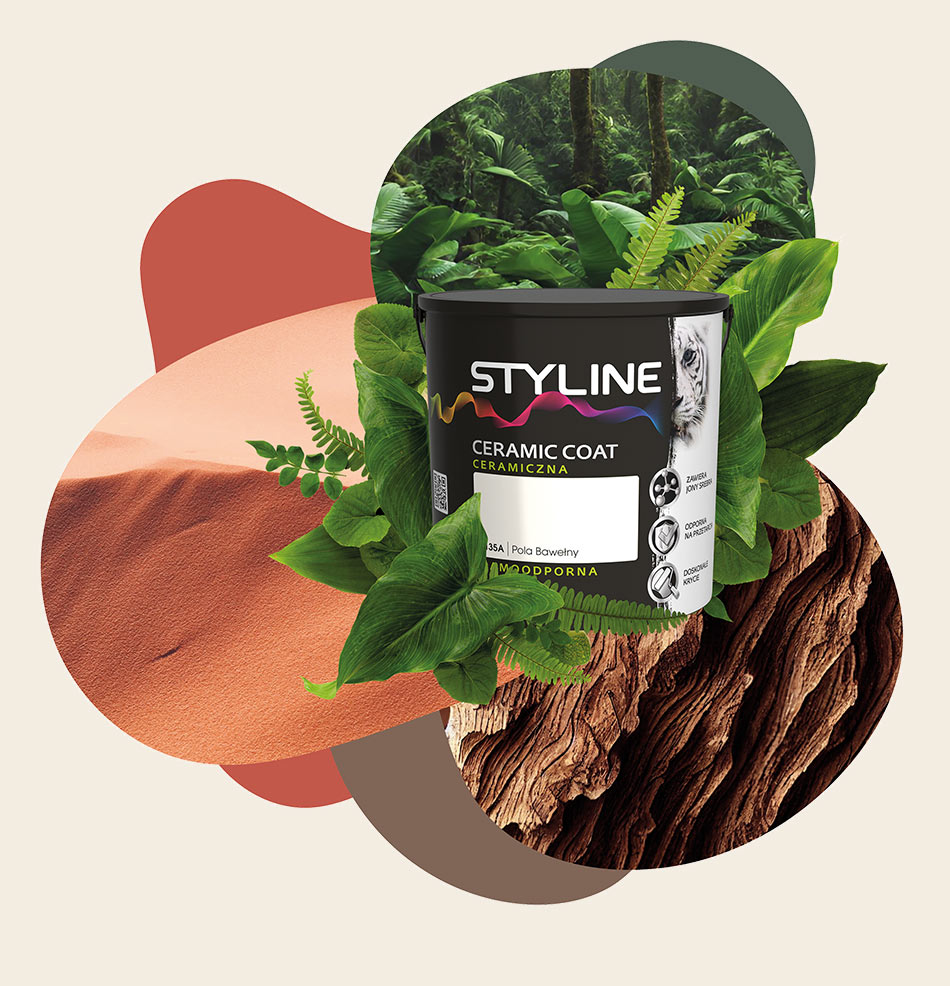
The STYLINE collection features several dozen ready-to-use shades designed for interiors. The paints in this line contain ceramic fillers that enhance the coating’s durability, as well as silver ions with antibacterial properties. As a result, the colors are long-lasting and easy to maintain, which is especially important in high-traffic areas.
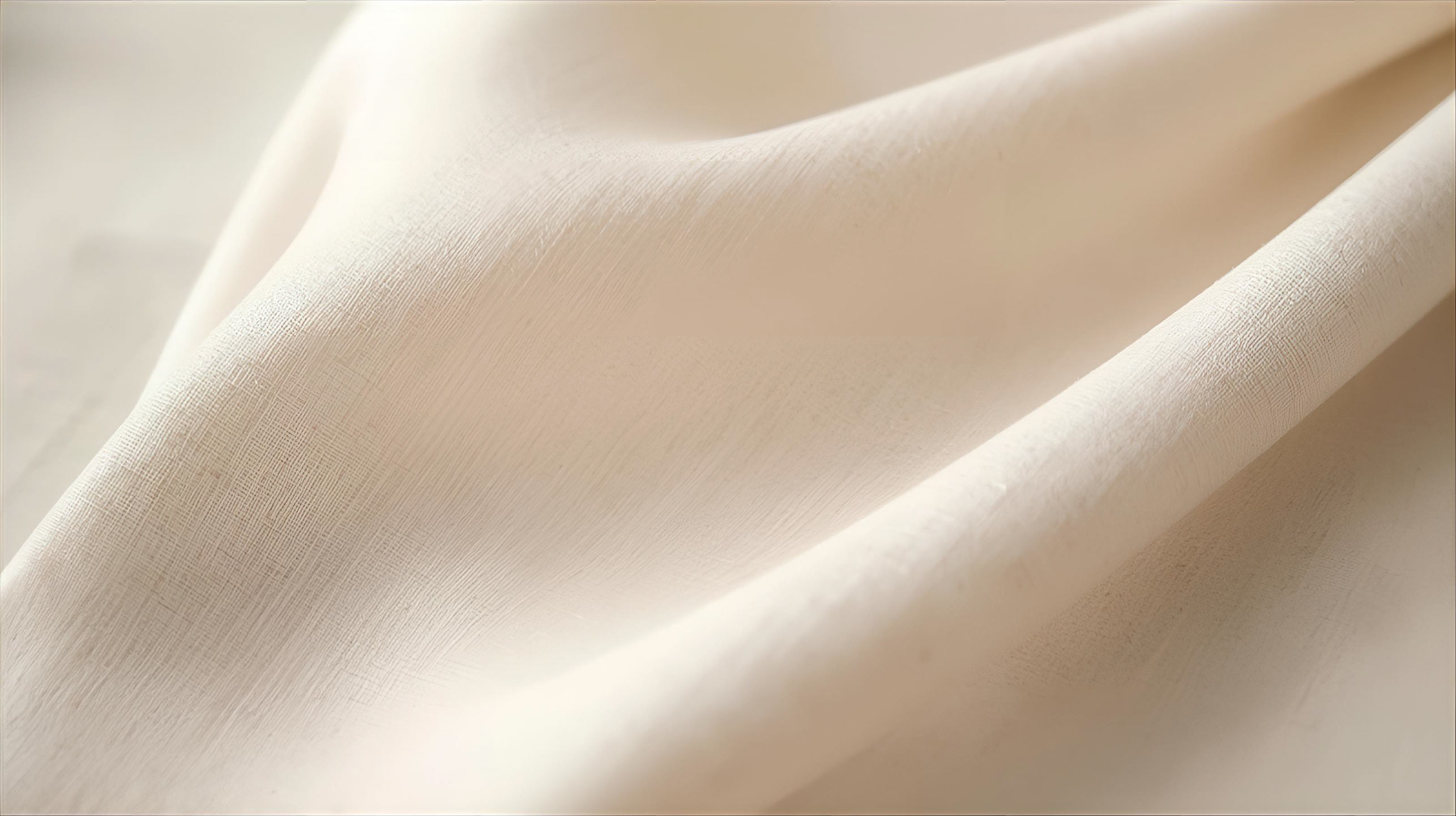
The palette itself includes, among others, Harmony of White 0117A, Rainforest 0118A, Strength of the Tree 0128A, Fashionable Beige 0130A, Fiery Earth 0138A, and Frosty Heather 0143A. The names intuitively convey the character of each color, and the codes simplify ordering and ensure consistent results.
The Power of the Tree
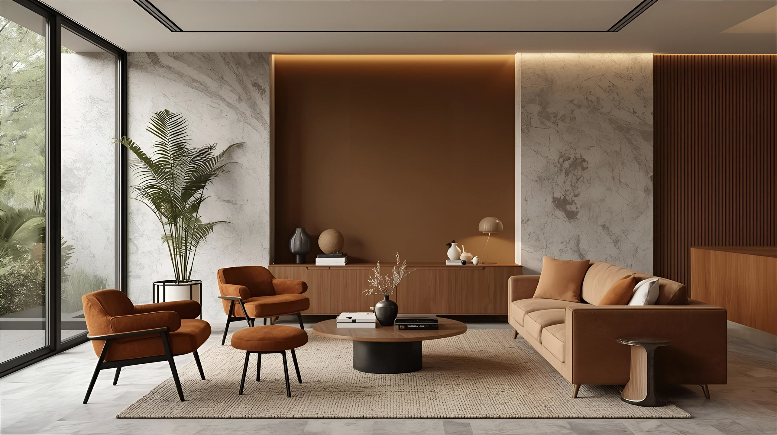
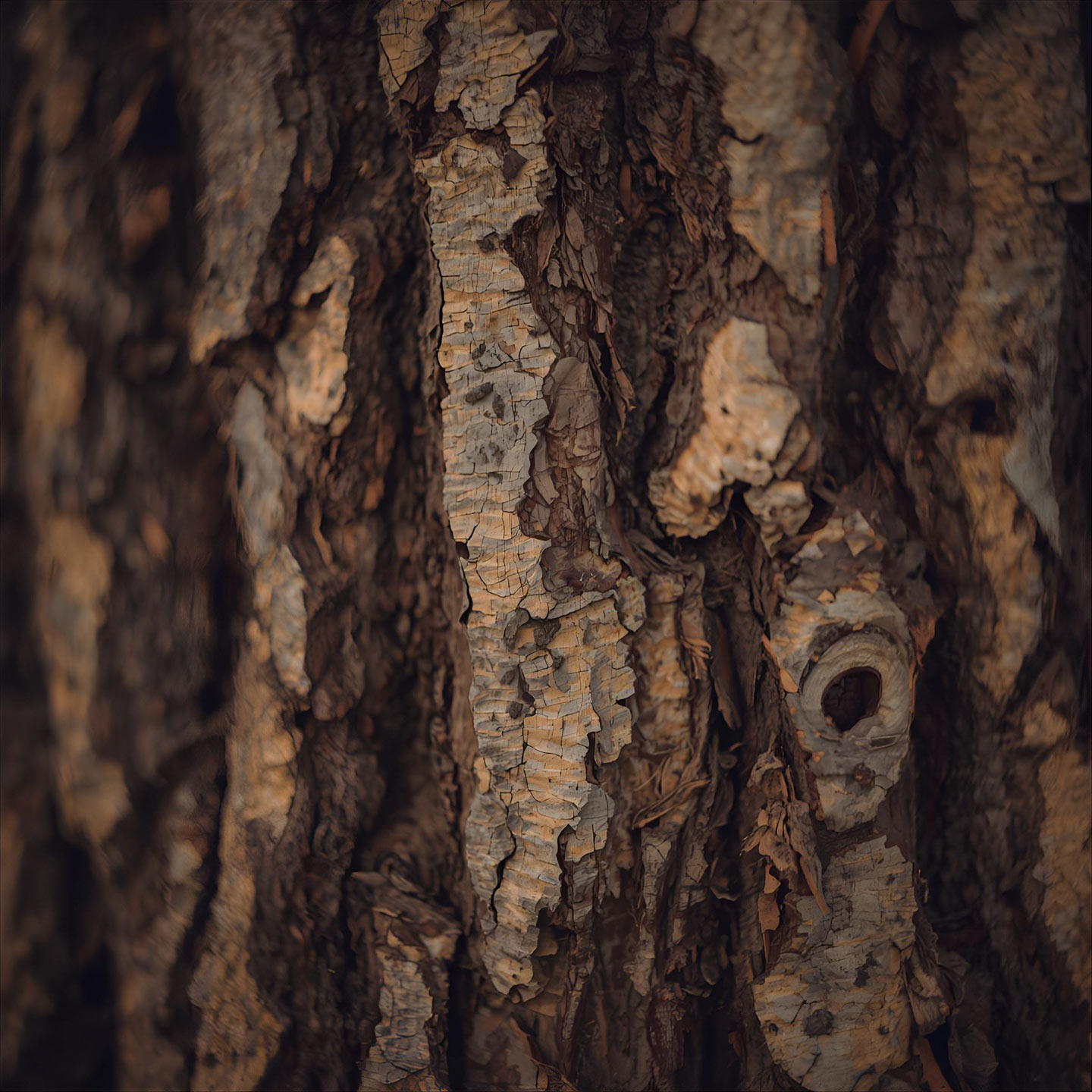
“The Power of the Tree” (0128A) is a warm, earthy color. Browns accentuate interiors and add warmth to minimalist designs. Global color trends for 2025 point to a return to muted browns and sensory tones, a trend confirmed, among other things, by Pantone’s color selection for this year.

Rainforest
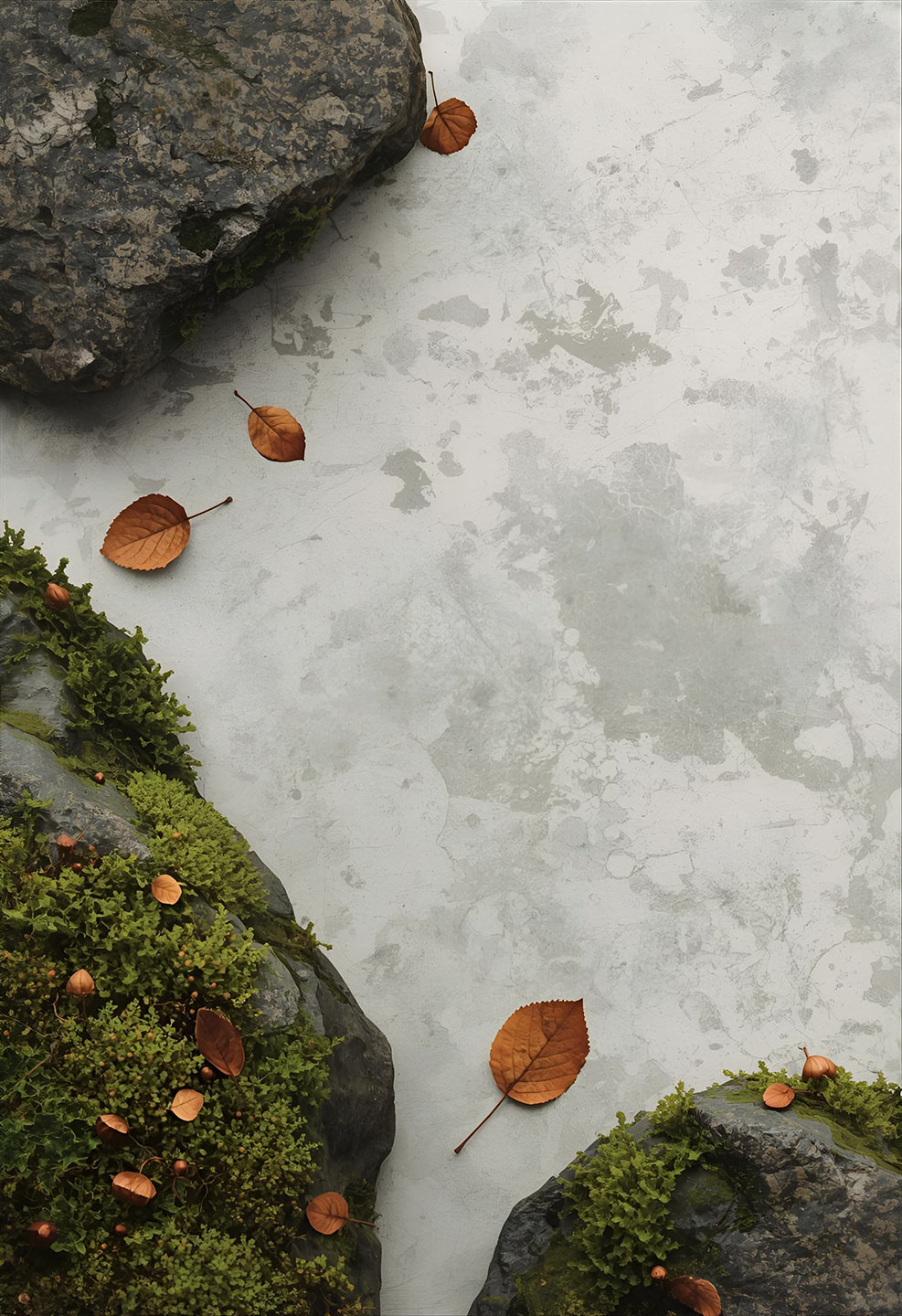
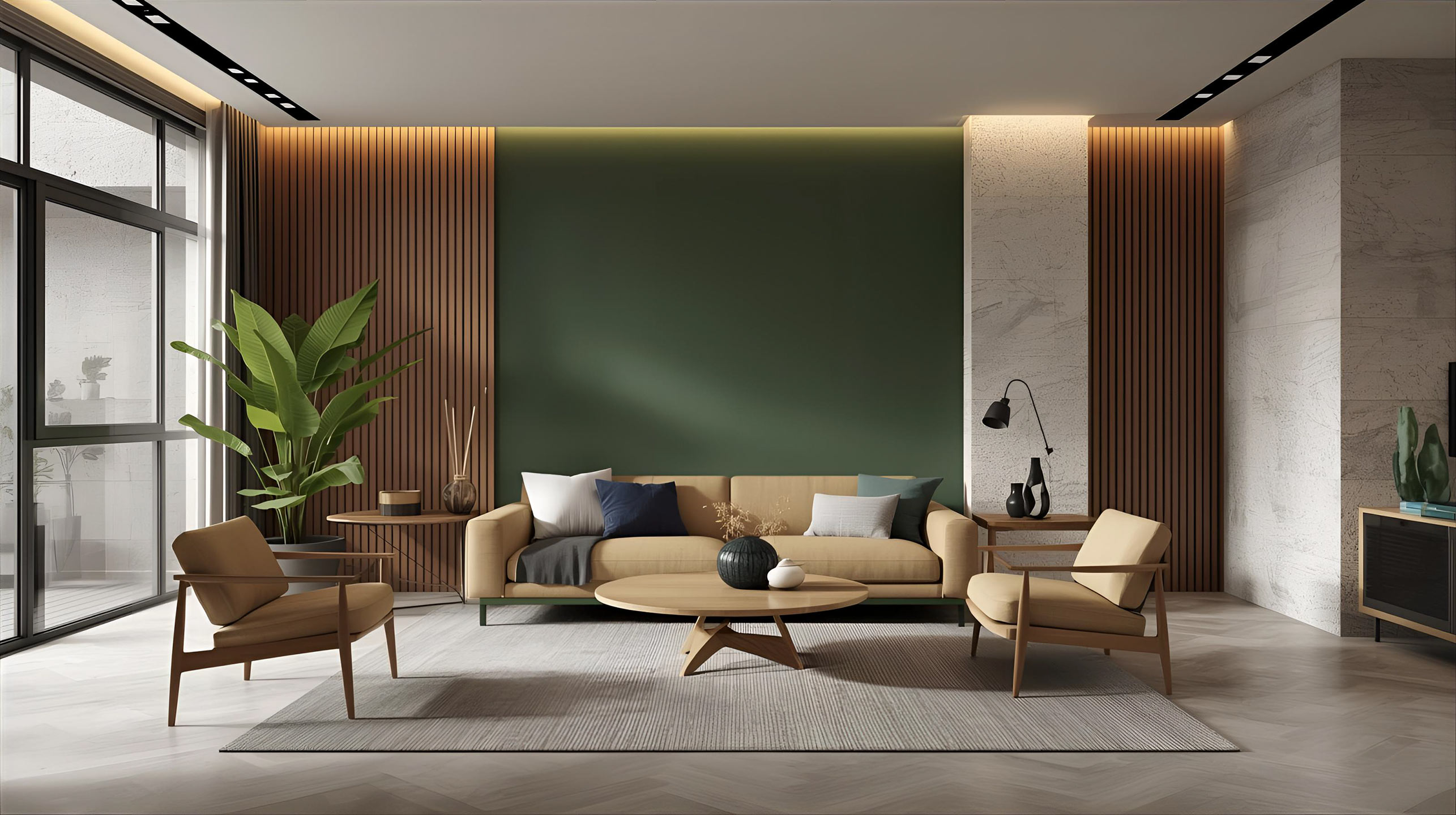
“Rainforest” (0118A) is an option for those seeking peace and a connection with nature. Deeper shades of green work well in living rooms and bedrooms, especially when paired with beiges and wood. The trends for 2025 further reinforce the role of green as a color that brings calm and a sense of relief.

Land of Fire
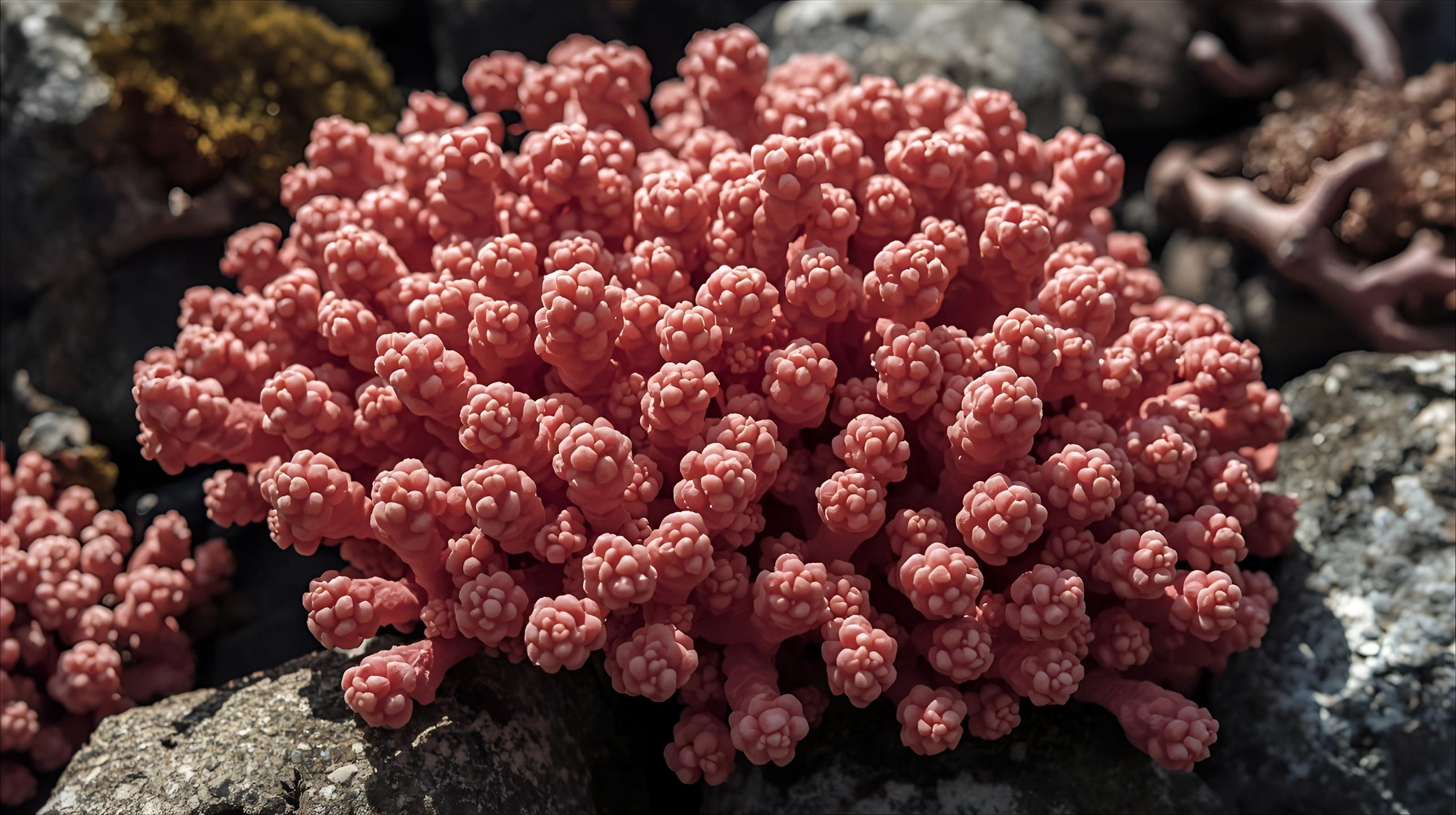
“Fiery Earth” (0138A) is a bold, energetic variation on terracotta and rusty hues. It pairs well with natural fabrics, stone, and black accents, lending the interior a contemporary feel. Similar warm, spicy tones appear in this year’s collections.

In 2025, designers are turning their attention to colors rooted in nature—warm and cozy. On the one hand, there is a shift toward browns with a coffee-like depth; on the other, sunny yellows and cheerful, plant-inspired greens are gaining prominence. Examples: Pantone’s selection highlights a soothing, warm brown as a reference point, while AkzoNobel promotes the cheerful shade of yellow “Hello Yellow” as a color that boosts the energy of an interior. This combination of trends makes it easier to build a color palette based on warmth, light, and balance.
0117A
0118A
0119A
0120A
0121A
0122A
0123A
0124A
0125A
0126A
0127A
0128A
0129A
0130A
0131A
0132A
0133A
0134A
0135A
0136A
0137A
0138A
0139A
0140A
0141A
0142A
0143A
0144A
0145A
0146A
0147A
Check out our color palette and find your perfect shade!
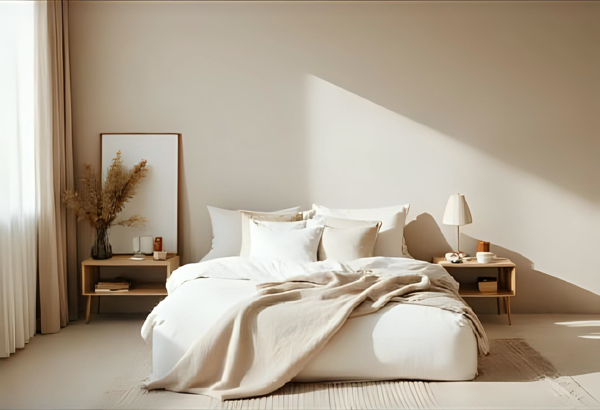
If you want to see the full range of interior colors and match a shade to your own lighting and materials, go to the Interior Color Palette. There, you can compare ready-made samples and quickly choose your colors for the entire apartment.
The quality and durability of the color stem from both the formula and the selection of pigments. The STYLINE CERAMIC COAT line uses ceramic fillers that ensure high mechanical resistance of the coating and make cleaning easier, while silver ions help maintain hygiene on walls in high-touch areas. This translates to long-lasting aesthetics and color stability. The brand also emphasizes its commitment to safe ingredients, ensuring the well-being of all household members.
Frequently Asked Questions
Zacznij od neutralnej bazy i dodaj uzupełniający półton oraz akcent. Sprawdzają się pary: beż + zieleń + ciemniejszy brąz, szaro-beż + błękit + grafit, ciepła biel + czerwień + oliwka. Zachowaj proporcje 60–30–10 i kontroluj temperaturę barw w świetle dziennym oraz sztucznym.
To zestaw odcieni, które wspólnie budują spójny charakter wnętrza. Ułatwia wybór farb, ogranicza liczbę prób i poprawia powtarzalność efektu przy kolejnych metamorfozach. W gotowych kolekcjach Styline znajdziesz nazwy i kody kolorów, dzięki czemu szybko odtworzysz ulubione kombinacje.