
PRO60 Palette
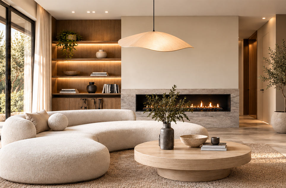
PRO 60 is a carefully curated collection of 60 interior colors selected from among more than 2,500 shades available in the STYLINE color chart.
The most popular colors have been organized into harmonious groups, in which each light shade can be easily paired with a matching, darker color of a similar character. It’s a simple way to create a cohesive design—without having to compare tones yourself or wonder whether the colors you’ve chosen will work well together.
What is the PRO60 palette and how do you use it?
A color palette is a set of shades selected to harmonize with one another. In interior design, it makes it easier to establish a dominant color scheme and accents so that rooms look cohesive but not identical. When using a color palette, you choose a base color (e.g., neutral beige), 1–2 complementary colors (warm gray and green), and an accent color (a deeper brown on one wall or on furniture fronts). In Styline’s ready-made collections, you’ll find names and codes, allowing you to recreate your chosen combinations without the risk of color variations between paint batches.
How do you choose the right color palette for an interior? The key factors are the light and the room’s function. Cooler northern light pairs well with warmer tones, while well-lit living rooms can handle bolder colors. It’s helpful to know a few simple rules:
- 60–30–10: base color covers about 60% of the surface, secondary color 30%, and accent color 10%.
- Color temperature contrast: pair warm neutrals with a cool accent—or vice versa.
- Color psychology: greens are calming, yellows energize, browns add warmth, and blues soothe.
This approach allows you to quickly build a cohesive color palette without creating a chaotic effect.
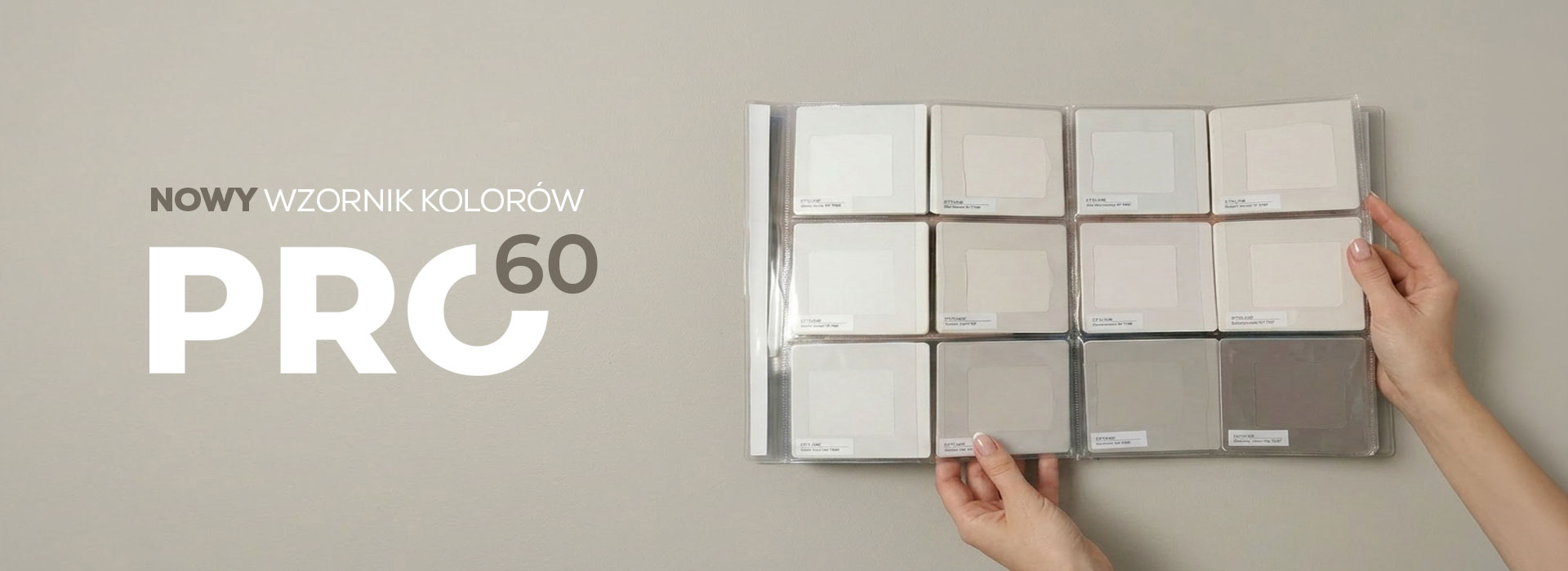
Color Palette – Trendy Shades for 2025
6P 1888
8P 0198
8P 1697
8P 2767
8P 1960
7P 0187
8P 1706
7P 0188
8P 1698
8T 1708
8T 2763
8D 1727
4P 1850
7P 1950
3P 1864
3P 0066
7P 2465
8T 1707
3P 0245
8T 2752
8A 1728
3P 0081
8P 0345
6P 1895
8P 1802
8P 0206
8T 2689
8T 2610
8T 2609
8T 3009
8T 2701
8D 2686
8D 2612
5P 1893
7P 3002
8P 1801
8P 2607
5P 1894
8P 2616
8P 1690
8P 2673
8A 2678
4P 1883
4P 1878
7P 1521
4P 0099
7P 2926
7T 1531
7T 2961
7T 2960
7D 2930
6P 1889
6P 1898
7P 1955
5P 0146
6P 1281
1P 1907
8T 1747
8T 2581
1D 1998

Cool Beiges
Subtle beiges with a cool, slightly gray undertone create a calm and elegant foundation for contemporary interiors. They pair beautifully with light wood, stone, linen, and accents in shades of graphite and muted blue. It’s the perfect palette for minimalist spaces where light, harmony, and timeless simplicity are key.


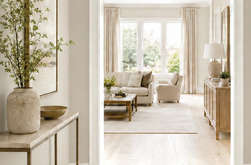
Natural Beiges
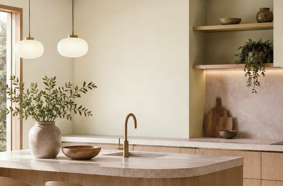
Natural beiges bring warmth, softness, and a cozy atmosphere to any interior, inspired by the colors of sand, stone, and earth. They pair perfectly with wood, travertine, bouclé fabrics, and other natural textures. They create welcoming, serene interiors that remain elegant regardless of changing trends.
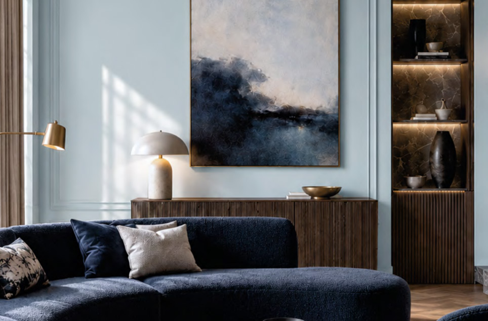
Luxurious Grays
Contemporary grays are multifaceted—they feature subtle hints of blue, green, beige, and graphite. This makes them an elegant backdrop for wood, stone, soft fabrics, and bolder color accents. They work well in both minimalist designs and interiors with a more classic, timeless character.
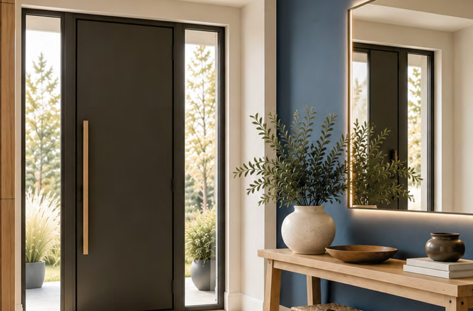
Harmonious Shades of Gray and Blue
Smoky blues combined with a delicate gray bring a sense of calm, freshness, and visual lightness to an interior. They look particularly striking when paired with cool beige, natural wood, light-colored stone, and cream-colored fabrics. This is an elegant alternative to classic gray, perfect for bedrooms, living rooms, and spaces designed to promote relaxation.
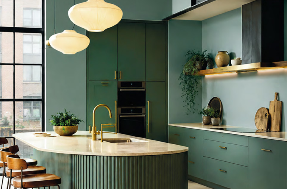
Elegant Greens
Shades of sage, olive, moss, and muted green evoke nature and lend interiors depth without compromising harmony. They pair beautifully with stone beige, walnut, light wood, and metal accents, creating serene and elegant compositions. Green works well both as a subtle backdrop for the entire interior and as a bolder color that defines its character.
Elegant Violets
Muted violets, powdery mauve, and deeper plum tones lend interiors a sophisticated, atmospheric character. When paired with beige, wood, stone, or brushed metal, they look modern and exceptionally elegant. These are colors for spaces where subtle luxury blends with individual style.
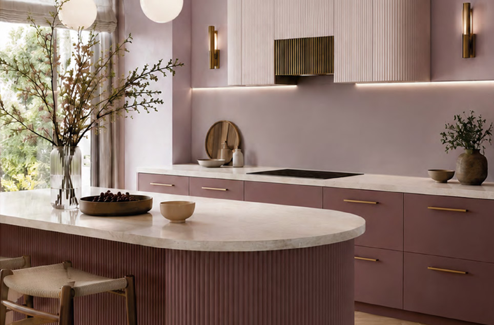
Check out our color palette and find your perfect shade!

If you’d like to see the full range of interior colors and choose a shade that matches your lighting and materials, go to Color palette – interior.
There, you can compare the ready-made samples and quickly decide on your colors for the entire apartment.
The quality and durability of the color result from both the formulation and the selection of pigments. The STYLINE CERAMIC COAT line uses ceramic fillers that provide high mechanical resistance and make cleaning easier, while silver ions help maintain hygiene on walls in high-touch areas. This translates to long-lasting aesthetics and color stability. The brand also emphasizes its commitment to safe ingredients, ensuring the well-being of all household members.
